
A "Cost Breakdown" block turns your estimate into a chart rather than a table. You choose how the costs are grouped and which chart to draw, and the block shows where the money sits — which is often the one thing a reader takes away from a report.
To add a "Cost Breakdown" chart to an estimate report follow these steps.
Navigate to the desired estimate and select the "Report" tab, then open the report you want to edit.
Press "Add Block" at the top of the "Report Structure" panel on the right.
Find "Cost Breakdown" under the "MAIN BLOCKS" heading. It is described as "Cost breakdown by grouping dimension".
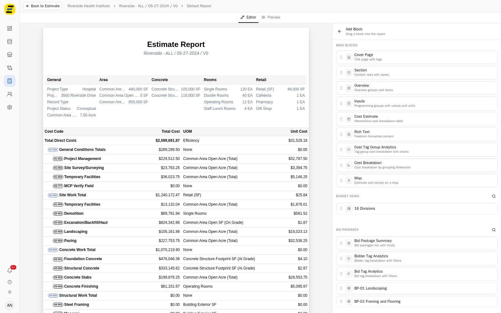
Drag it into the report and drop it on the line where you want it to sit. Blocks are added by dragging, not by clicking.
Press the block in the "Report Structure" panel to open its settings, and open the "CHART" section.
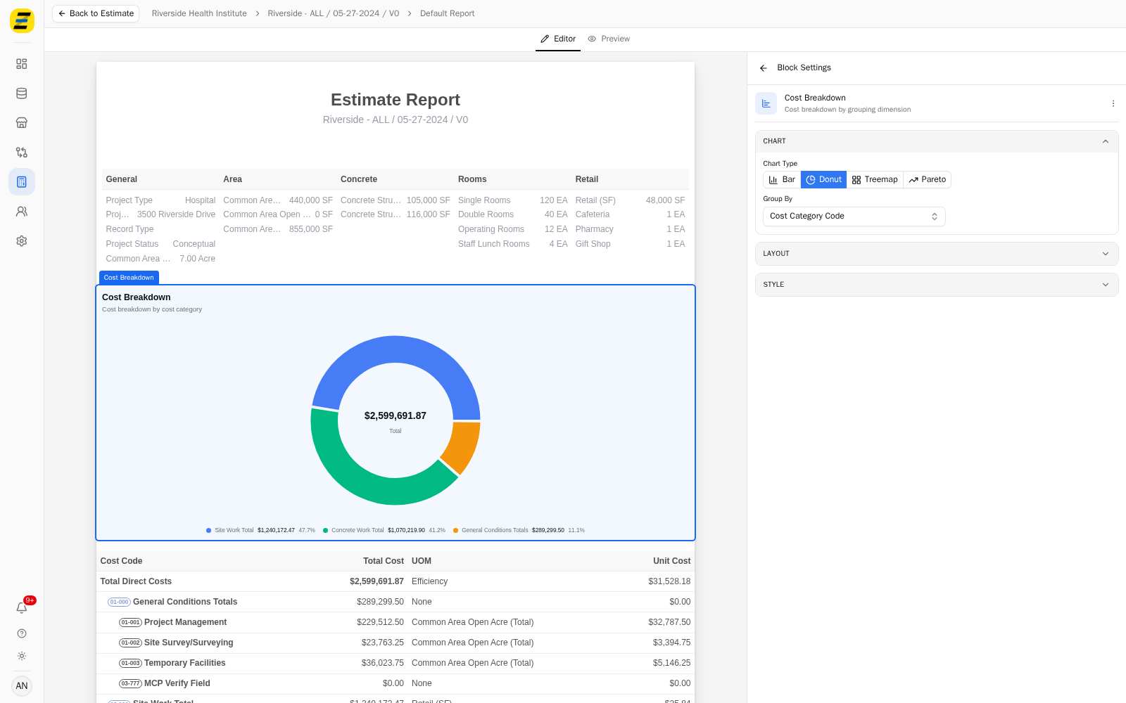
Choose a "Chart Type". There are four, shown as buttons across the top.
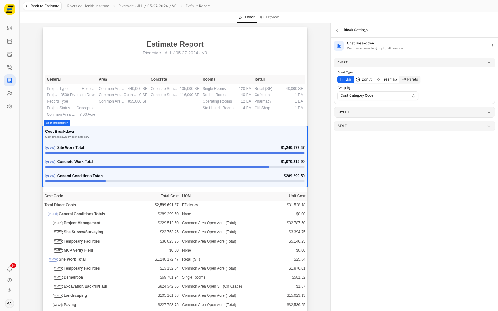
"Bar" — a labelled bar per group, with its value. The default.
"Donut" — the same groups as proportions of the whole.
"Treemap" — nested rectangles sized by cost, useful when there are many groups.
"Pareto" — bars in descending order with a cumulative line, for finding the few groups that carry most of the cost.
Choose a "Group By" to decide how the costs are gathered.
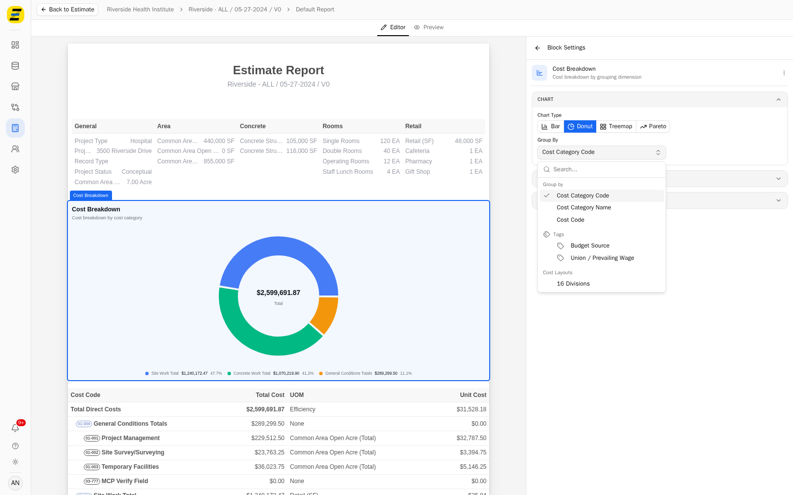
The list holds three fixed groupings followed by your own:
"Cost Category Code" and "Cost Category Name" — by cost category.
"Cost Code" — by individual cost code.
Then every tag group on the estimate, by name, and every budget view, by name.
NOTE, when you group by a budget view an extra depth control appears, so you can chart the top level of the view or drill further down it.
Open the "LAYOUT" section to set the "Padding" inside the block, the "Margin Bottom" beneath it, and "Page Break After" if this block should be the last thing on its page.
Open the "STYLE" section to set the bar color, the "Font Size", and the "Border Bottom" width and "Border Color".
NOTE, the chart's subtitle follows your grouping — grouping by cost category renders "Cost breakdown by cost category" beneath the title, so the reader is told how the chart is cut without you writing it.
We recommend "Pareto" when the point of the chart is that a handful of categories dominate, and "Donut" when the point is the split between a small number of groups. "Bar" reads best when the exact values matter, since it is the only one that shows each figure beside its group.